Page 1 of 2
Fan Art and Covers
Posted: Thu Apr 09, 2009 1:11 am
by emmetmcl
A few months ago, I made a DRIVER 4 cover for PSP.
Here it is:
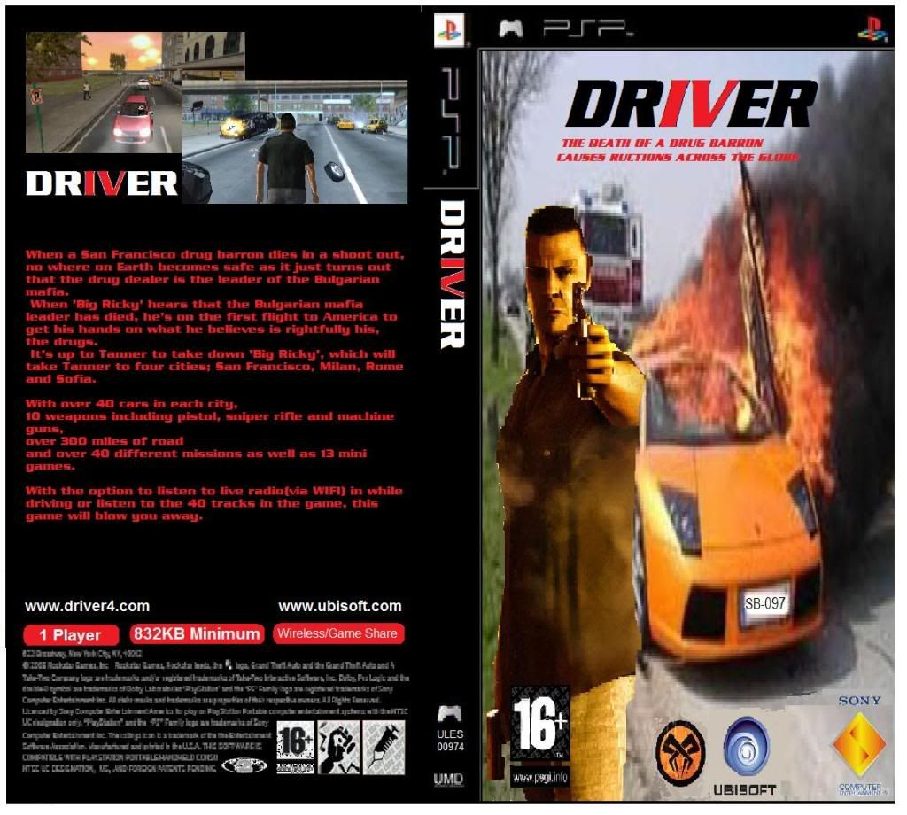
Please tell me what you think.
Also, post your own stuff up too.
Posted: Thu Apr 09, 2009 2:06 am
by Smiler
Nice!
Heres a pic I put together before for the PC versions Boxart

and a (Vista & W7 compatable) D3 Icon

Posted: Thu Apr 09, 2009 3:22 am
by Smiler
*Update*
Here is one that I have just made, which I would like to see as the next Drivers Boxart!.
*EDIT*
its too big for the forums, so heres the link instead (56k users beware!)
http://img116.imageshack.us/img116/7981 ... eelman.png
*EDIT#2*
heres a low res version:

Posted: Thu Apr 09, 2009 4:26 am
by Driver of DOOM
Nice, my man, that looks sweet, wish i had the skills to make 1!

Posted: Thu Apr 09, 2009 6:37 am
by emmetmcl
Smiler;
The windows one is really good, would be even better with the Driver font.
What program did you use, I'm only using Microsoft Paint.
On the second one (the PSP one) where did you get the pictuer of Tanner becasue it looks it would on PS3.
Are they really hard to make, because I thought mine was, the pictures on the back are from Driver Parallel Lines screenshots, I just took out TK and put in Tanner and the front pic is a picture of Tanner in front of an image I got from Google.
Posted: Thu Apr 09, 2009 6:55 am
by Smiler
emmetmcl wrote:Smiler;
The windows one is really good, would be even better with the Driver font.
What program did you use, I'm only using Microsoft Paint.
On the second one (the PSP one) where did you get the pictuer of Tanner becasue it looks it would on PS3.
Are they really hard to make, because I thought mine was, the pictures on the back are from Driver Parallel Lines screenshots, I just took out TK and put in Tanner and the front pic is a picture of Tanner in front of an image I got from Google.
I would suggest using Paint.net which enables you to use layers,
and using layers enables you to cut out a hole in the top layer and paste an image in the bottom layer so you dont have to worry about the artwork covering the parts of the box art that you want on show (such as the psp logos that you see on that image)
and with paint.net when you rezise an image it doesn't badly affect the image quality of that pic which you are resizing!.
as for finding the artwork that I used, well I just searched google images for driver artwork, because I wanted something that would suit the Driver theme.
I didn't show any ingame shots on the boxart because DrIVer is still in development so I dont know what the game looks like yet...
But I think when we get a few ingame shots, the boxart would only need a minor adjustment to fit the part!
oh and, I came up with the name because Reflections are always trying to make the latest Driver titles as close to the original as possible, so calling it 'DrIVer: You are the wheelman' would kind of be a good hint that it would finally be what they have always been trying to make it!.
anyway, good luck!.
Posted: Mon Apr 13, 2009 10:56 am
by emmetmcl
Made another one, this one is for PS3.
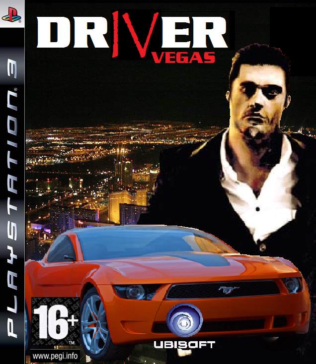
Took me about 45 mins in Paint.
Posted: Mon Apr 13, 2009 11:26 am
by bb_42001
paint? as in Microsoft crappy paint?
Posted: Mon Apr 13, 2009 11:56 am
by Nikusakken

I've posted this in another topic somewhere...
Posted: Tue Apr 14, 2009 1:03 am
by emmetmcl
bb_42001 wrote:paint? as in Microsoft crappy paint?
Yes, Microsoft crappy Paint, but I believe the correct term is Microsoft Paint: Crap Edition.

Posted: Tue Apr 14, 2009 2:21 am
by emmetmcl
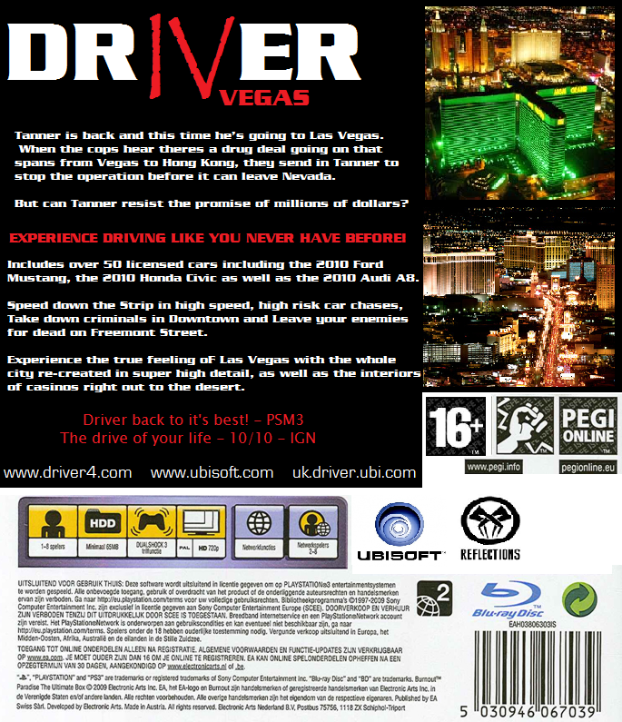
And here's the back of the game box:
Posted: Tue Apr 14, 2009 2:53 pm
by bb_42001
they are looking good, i wish i was good at that sort of thing
Posted: Tue Apr 14, 2009 7:21 pm
by Smiler
Heres the PC version of my Boxart, with a (Vista & W7 compatable) Icon.


Posted: Thu May 14, 2009 4:01 am
by emmetmcl
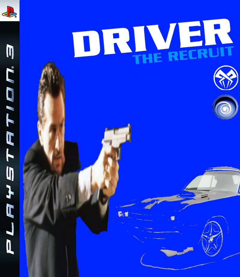
Here's a logo I made for the new Driver game, as you can see it's not great but I was bored and made it in about 2 minutes.
Anyway, what does everyone think?

Posted: Thu May 14, 2009 4:06 am
by Smiler
emmetmcl wrote:Here's a logo I made for the new Driver game, as you can see it's not great but I was bored and made it in about 2 minutes.
Anyway, what does everyone think?
Even if it was a quick 5 minuite one, its good to see that you used your imagination with using the same R for both the R in dRiver and the Recruit
Good Work!, Hope to see you add that to some custom Boxart!.
Posted: Thu May 14, 2009 4:58 am
by emmetmcl

Here's another quick one.
Posted: Thu May 14, 2009 7:33 am
by Driver of DOOM
Coolio, now I want to make one; does anybody know if DRiver 4.com already has made some as they seem the most artistic(but i don't fancy trawling French pages needlessly!).
Posted: Thu May 14, 2009 8:08 am
by Smiler
Could I just ask what the Driver Font is?...

Posted: Sat May 16, 2009 3:19 am
by emmetmcl
its called Babylon5. i you PM your email adress 2 me ill send it 2 ya.
Posted: Thu May 21, 2009 4:38 am
by emmetmcl
Posted: Thu May 21, 2009 4:42 am
by emmetmcl
Posted: Thu May 21, 2009 7:21 am
by Driver of DOOM
Binging, i am gonna make a one over the Half term, finally a lapse in exams!
Posted: Thu May 21, 2009 12:18 pm
by Nikusakken

Done it in 5 mins. I know that it's not that great though.
Posted: Fri May 22, 2009 12:10 am
by Driver of DOOM
I think its pretty groovy!
Posted: Fri May 22, 2009 7:03 pm
by bb_42001
I love nicks Driver Font
Posted: Sat May 23, 2009 3:54 am
by emmetmcl
Yeah, it's cool. (whats it called BTW?)
But I'd rather it if they would stick with the Babylon5 one.
Posted: Sat May 23, 2009 11:53 am
by Nikusakken
The font that I used is called Defused. While for "The Recruit" I used the Babylon5.
Posted: Thu May 28, 2009 7:39 am
by emmetmcl
Here is another box art I made.
I tried to make the man look the same way as the car, as in, sort of outlined.
Was lost on where to put the UBISOFT logo and the Reflections logo since they wouldn't look good covering the car at the bottom.
Anyway, what does everyone think?
Posted: Thu May 28, 2009 7:56 am
by Moonchild
Regardless of quality, I’d give it a 10/10 just because Neil McCauley from Heat is there, and the Reflections logo shouldn’t be on the cover since they lost that privilege a long time ago...
Posted: Sat May 30, 2009 11:03 pm
by Smiler
I decided to get inspiration from emmetmcl's pic and add a personal twist to it! (the girls on there because someone suggested in another topic that tanner should have a girl in the next Driver title

)
