Page 1 of 1
New Logo
Posted: Sun Jun 13, 2010 1:38 pm
by Fireboyd78
What does everyone think? Feedback wanted! Are there anymore images I should add? etc.
Thanks, everybody!
If you cannot see the new logo, please do "ALT + F5" to refresh your cache for Driver Madness.
Re: New Logo
Posted: Sun Jun 13, 2010 2:01 pm
by PostalDude
Looks awesome.
Re: New Logo
Posted: Sun Jun 13, 2010 2:38 pm
by Fireboyd78
Thanks PD!
Re: New Logo
Posted: Sun Jun 13, 2010 7:24 pm
by T.K.
I don't see it.
THE FAVICON HOWEVER is quite awesome.
Re: New Logo
Posted: Sun Jun 13, 2010 9:47 pm
by bb_42001
alt + f5, the old header is probably still in your computers cache.
Re: New Logo
Posted: Sun Jun 13, 2010 10:07 pm
by T.K.
Oh, thanks bb.
Pretty darn cool, I say.
Re: New Logo
Posted: Sun Jun 13, 2010 10:47 pm
by bb_42001
i think the logo looks a lot more professional now.
Re: New Logo
Posted: Sun Jun 13, 2010 11:22 pm
by T.K.
Yeah, it doesn't have a cursor in it. The old one did.
Re: New Logo
Posted: Sun Jun 13, 2010 11:45 pm
by bb_42001
it did?
Re: New Logo
Posted: Mon Jun 14, 2010 12:03 am
by T.K.
Yep. Over the Zenda or whatever the hell it was called. The white exotic. I tihnk right over the headlight.
Re: New Logo
Posted: Mon Jun 14, 2010 5:24 am
by Fireboyd78
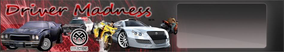
That is why I replaced it. That damn cursor!
Re: New Logo
Posted: Mon Jun 14, 2010 5:33 am
by T.K.
AGRGAGRGARGAGRAGRGARGAGRAGRGAR
Re: New Logo
Posted: Mon Jun 14, 2010 6:07 am
by Wheelman75
Looks cool, except it's missing a Driver 2 picture.
Re: New Logo
Posted: Mon Jun 14, 2010 8:10 am
by Fireboyd78
Wheelman75 wrote:Looks cool, except it's missing a Driver 2 picture.
I know man, I couldn't find any good Driver 2 pictures. If anybody wants to find a GOOD QUALITY Driver 2 picture, I'll be glad to add it to the logo! I still have the PSD file saved, so I can still edit it.
Re: New Logo
Posted: Mon Jun 14, 2010 8:17 am
by T.K.
It's fine as is. I thought the old one was a little crowded.
Re: New Logo
Posted: Mon Jun 14, 2010 4:47 pm
by max.thunder
Re: New Logo
Posted: Tue Jun 15, 2010 6:52 am
by Miller
This looks cool. I like it better with only older cars. The last one was cool, too, though.
I think the cars in this one are arranged nicely, but it seems, to me, like the words should be moved over to the right some to occupy more of that space and allow more of the silver car to show. Maybe the lower-left part of the parralel lines could actually be tucked in behind the silver car if the overlap is not much. Maybe a pylon (or whatever you call the orane and white thingy) could be placed in front of the parallel lines and a tiny bit of the words on the lower-right side, or one of those barrier arm piece things.
Oh, yeah, and put back the cursor. Hell, I cannot even see it now while trying to look for it in the other image.